10 Essential Tips for Designing Beautiful and Effective Dashboards
- The UX Lens
- Dec 15, 2024
Creating dashboards that are both visually appealing and user-friendly doesn’t have to be daunting. With the right strategies, you can turn your dashboards into powerful tools that deliver insights effortlessly. Here’s how to design dashboards that captivate and inform users effectively:
1. Keep It Simple and Intuitive
-
Use clear navigation menus, such as sidebars, to help users access sections like “Dashboard,” “Tables,” or “Profile” with ease.
-
Keep text minimal and concise. Rely on charts, summaries, and visuals to convey key information quickly.
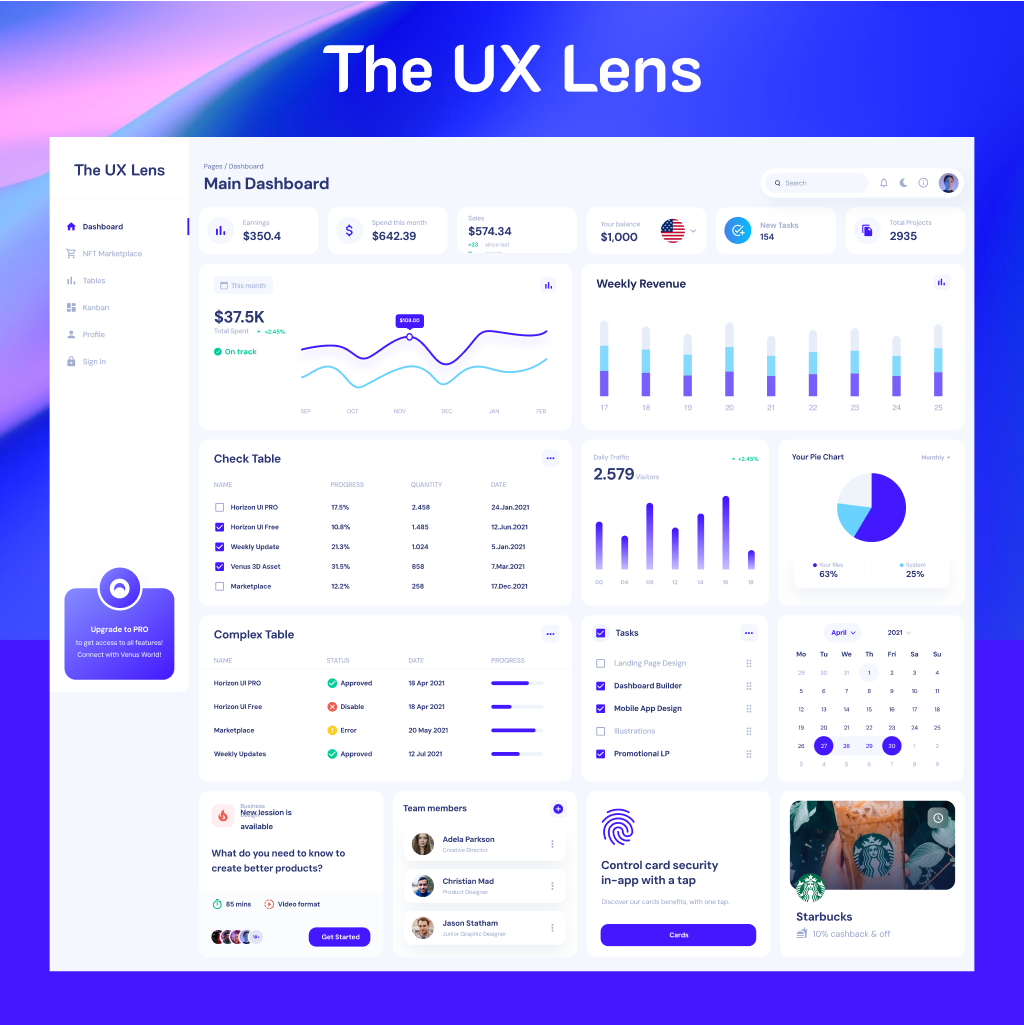
2. Organize Information Hierarchically
-
Place critical metrics like sales, revenue, or performance indicators at the top where users naturally look first.
-
Group related elements together (e.g., “Weekly Revenue” alongside “Daily Traffic”) for logical flow and better comprehension.
3. Enhance Visual Clarity
-
Use charts (e.g., bar, line, or pie) to simplify complex data, making it digestible at a glance.
-
Incorporate consistent whitespace between sections to reduce clutter and improve readability.
4. Make Data Actionable
-
Provide tables for detailed information and use progress indicators or checklists to guide user actions.
-
Add actionable elements, like buttons or links, to encourage user engagement and interactivity.
5. Use Visual Cues Wisely
Implement color coding to highlight changes (e.g., green for positive growth, red for declines).
Leverage icons to improve navigation and understanding (e.g., calendar icons for schedules or user icons for profiles).
6. Prioritize Personalization
Allow users to customize their dashboards by rearranging cards or widgets to suit their preferences.
Personalization improves usability and fosters a sense of ownership.
7. Limit Colors for Consistency
Stick to 2-3 complementary colors to maintain a clean and professional look.
Use color intentionally to emphasize key data points without overwhelming users.
8. Ensure Responsiveness
Optimize dashboards for all devices, including desktops, tablets, and smartphones.
On mobile, limit the number of cards displayed in a row to three for better usability and scrolling.
9. Design for Accessibility
Use high-contrast colors and readable font sizes to make dashboards inclusive.
Avoid relying solely on color; use patterns or labels for users with color vision deficiencies.

10. Test, Iterate, and Improve
Collect user feedback during development to ensure relevance and usability.
Monitor how users interact with the dashboard and refine designs based on analytics and feedback.
Final Thoughts
Great dashboards don’t just present data—they tell a story. By simplifying layouts, prioritizing key information, and optimizing interactivity, your dashboards can empower users to make confident decisions. Remember, less is more when it comes to effective dashboard design.
Have more tips to share or questions about improving dashboard designs? Let’s connect in the comments! Together, we can make dashboards awesome.