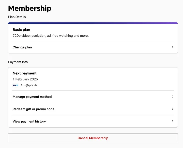
The Power of "Cancel Anytime"
The Tricks Behind Unsubscribing:
Deep Navigation – Users have to dig through their account settings to find the cancellation option. The more steps involved, the more likely they’ll reconsider.
Low-Visibility Button – The Cancel Membership button is placed at the bottom of the page and designed as a ghost button, making it less prominent.
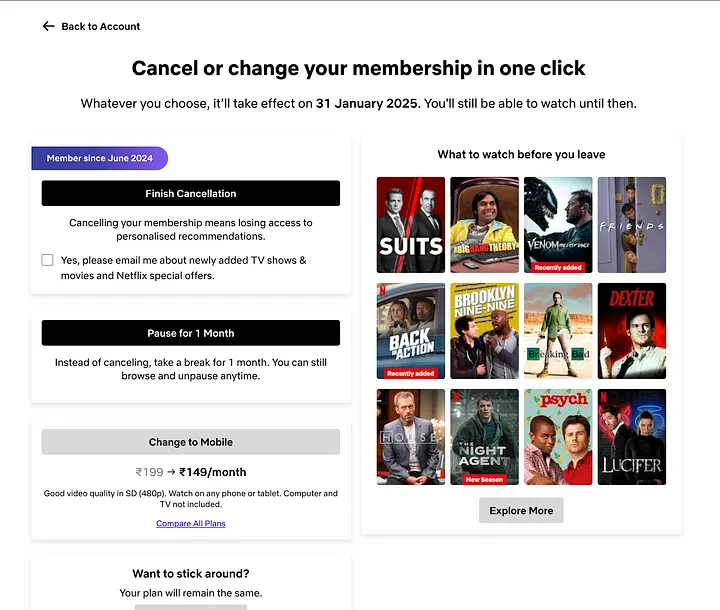
Emotional Triggers – Before confirming cancellation, Netflix reminds users of all the content they’ll miss out on and even offers alternatives like switching to a cheaper plan or pausing the subscription.
This process, known as a cancellation flow in UX design, aims to retain users without making the experience frustrating.
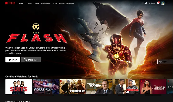
Immersive UX & Auto-Play: The Binge-Watching Trap
Immersive UX & Auto-Play: The Binge-Watching Trap
Big, bold visuals – Large posters with high-impact imagery draw users in.
Auto-play trailers – As you browse, trailers automatically start playing, keeping you engaged.
Watch Progress Indicators – Seeing how much you’ve watched encourages you to finish content.
Personalized recommendations – The platform continuously suggests new shows based on your viewing history.
Seamless auto-play – The next episode starts without needing user input, removing friction from the experience.
This kind of continuous engagement is similar to what platforms like TikTok and Instagram do to keep users scrolling.
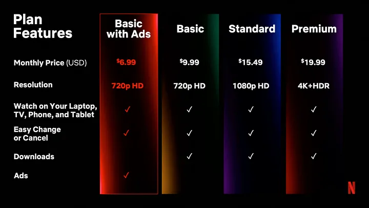
Netflix’s Ad-Supported Plan: A Strategic Shift
People are now used to ads – YouTube, Twitch, and other platforms have normalized ad-supported content.
Perceived value – Users feel they’re getting a great deal by trading ads for a lower price.
Price anchoring – By showing a lower starting price, Netflix makes its service seem more affordable and attractive.
Touchpoints: Netflix’s Invisible Marketing Machine
Netflix’s Multi-Channel Marketing Strategy:
YouTube Presence – Netflix runs multiple channels, posting clips, trailers, and interviews to drive interest.
Social Sharing – The Share button is strategically placed throughout the app to encourage recommendations.
Smart FAQs – The help section is designed to answer user questions quickly, reducing frustration and improving retention.
Great UX isn’t just about what happens inside the app—it’s also about how users discover and interact with it elsewhere.
Smooth & Intuitive Navigation
Before Subscription:
Top 10 Trending Section – Highlights popular shows and movies to spark interest.
Trailer Previews – Users can watch previews before signing up.
Limited Browsing – Unlike Amazon Prime, Netflix restricts full library access until you subscribe, creating curiosity.
After Subscription:
Simple top navigation bar – Categories like TV Shows, Movies, New & Popular help users explore easily.
Language-Based Browsing – Especially useful in multilingual countries like India.
Genre-Based Recommendations – Instead of overwhelming users with a long list, Netflix curates genre-specific sections like Recommended for You or New on Netflix.
By prioritizing user preferences, Netflix ensures smooth navigation, keeping users engaged longer.
Personalization: The Secret Ingredient
UX-Powered Personalization:
Multiple Profiles – Every family member gets a unique profile with personalized recommendations.
Custom Avatars – A small but effective touch that makes profiles feel personal.
Smart Notifications – Instead of generic alerts, Netflix sends personalized messages using your name and viewing history.
Dedicated Kids Section – A child-friendly interface with parental controls ensures a safe experience.
This level of customization makes users feel valued and keeps them coming back.
Content-Driven Design: Why Originals Matter
The Power of “Only on Netflix”
Netflix invests heavily in original content—hits like Stranger Things, Squid Game, Money Heist, and Wednesday have created a loyal fanbase. Exclusive content gives users a reason to subscribe and stay.
This strategy mirrors what we see on platforms like YouTube or Instagram, where content, not just UI, keeps users engaged.
Adapting to Changing Trends
New Features for the Future:
Moments Feature – Lets users skip to key moments in movies or shows, catering to short attention spans.
Mobile Games – Free games for subscribers add extra value and keep engagement high.
Accessibility: UX for Everyone
Inclusive UX Features:
Audio Descriptions – A voice-over narrates on-screen actions for visually impaired users.
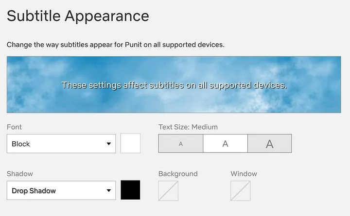
Customizable Subtitles – Users can adjust font size, color, and background for readability.
Dedicated Accessibility Page – A full guide to Netflix’s accessibility features ensures usability for all.
1 thought on “How Netflix’s UX Design Helps Acquire 200 Million Paid Users”
Konten yang informatif dan sangat bermanfaat