You spend weeks building a feature-rich app. The backend is smoother than a fresh jar of Skippy. APIs respond faster than your ex when they see a text from you.
You’re proud. You should be. It works.
Then someone — probably a non-tech friend or, God forbid, a client — tries using it and says the one thing that cuts deeper than a segfault:
“Umm… I don’t get it. What do I do here?”
Cue the internal screaming.
This is your reality check.
Being a full stack dev doesn’t mean you’re excused from UI/UX. In fact, if you build both front and back, you have zero excuses for a clunky experience.
So buckle up. Here are 7 no-BS UI/UX principles every developer needs to get tattooed on their brain.
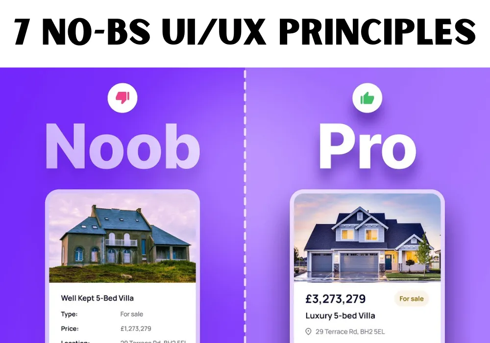
1. Clarity > Cleverness
Let me guess — you made a custom icon to represent “Delete.” It’s a stylized black hole that you think is genius.
But your user?
They just wanted a damn trash can.
Reality Check: If your mom, grandma, or your distracted co-founder can’t tell what a button does in 2 seconds, you failed.
Don’t reinvent the wheel. Reinvent the experience.
Use standard icons. Write clear labels. Clever is cute — clarity is cash.
2. Don’t Make Me Think (Thanks, Steve Krug)
No, really. That’s the title of a bestselling UX book. And it’s 100% gospel.
Every second a user spends wondering, “What does this do?” or “Where do I go next?” — you’re losing them.
Your app shouldn’t need a manual.
Tip: Next time you’re about to add an extra step, ask yourself:
Would this annoy me at 2 AM when I’m half-asleep ordering pizza?
If the answer’s yes — delete it.
3. Visual Hierarchy Isn’t Just Design Fluff
You know those sites where every element screams for attention?
Buttons in neon green, headers shouting in all caps, pop-ups dancing like it’s 2006?
Yeah. That’s visual anarchy.
Visual hierarchy guides the user like a GPS.
Big bold title = most important.
Muted button = secondary action.
White space = breathing room.
Let your UI whisper priorities. Not scream chaos.
4. Mobile-First Isn’t Optional Anymore
Your user is on the toilet. Reading your app. Scrolling with one thumb.
Judge them all you want — but you better design for them.
Stats don’t lie: Over 60% of web traffic is mobile. If your app breaks on smaller screens, you might as well break their trust too.
Reality Check: Test your app on mobile as soon as you write your first
. Not after launch. Not “next sprint.” Now.
5. Loading States = Emotional Therapy
You ever click a button and nothing happens?
You start questioning everything.
Did it work?
Should I click again?
Is my internet broken?
Am I broken?
Loading states are UX therapy. They calm users. They say, “Hey, I got you. Just a sec.”
6. Error States: Stop Gaslighting Your Users
“Something went wrong.” No. YOU went wrong.
Error messages should be human, helpful, and hopeful.
Bad:
“Unknown error. Try again.”
Better:
“We couldn’t upload your file. It may be too large or the network dropped. Try again in a moment.”
Even Better:
Tell them how to fix it. Give an action, not just a sigh.
7. Consistency = Trust
Imagine using an app where one page says “Submit,” another says “Post,” and another says “Done.”
Same action. Three names.
Your brain screams: WTF, is this the same thing or not?
Use a design system. Set rules. Stick to them. If your buttons change style every route, I’m calling the UI police.
Final Rant
You’re not just a full stack dev. You’re the architect of the experience.
Your users don’t care how beautifully your backend scales.
They care that they can reset their password without spiraling into existential dread.
Build it like you care. Like real people will use it. Because they will.
Did I roast your codebase a little too hard? Did I miss a principle you swear by? Let me know in the comments.
Clap if you laughed. Clap if you cried. Clap if you rage-quit and redesigned your app halfway through reading.
Either way — just don’t ignore UI/UX. Because if you do, your users will ignore you.