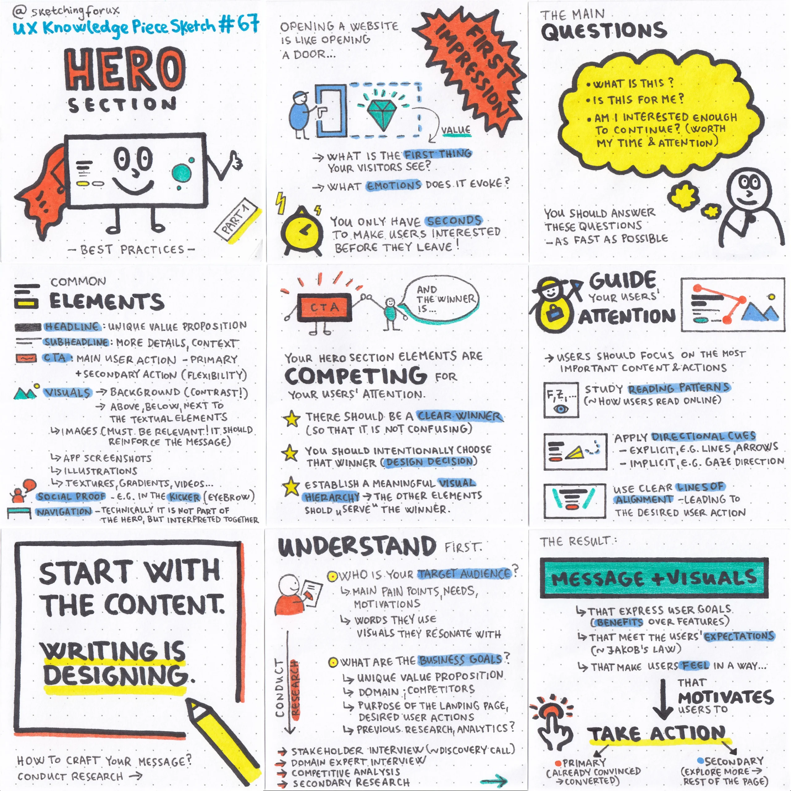
Best Practices & Inspiration for an Impactful Hero Section
Feb 27, 2025
Make a Lasting First Impression
You have only seconds to capture your visitors' interest before they leave. Opening a website is like stepping into a new room—what’s the first thing they notice? Is your value clear? What emotions does your page evoke?
Key Questions to Answer Quickly
Your visitors should instantly understand:
What is this?
Is this for me?
Is it worth my time and attention to continue?
Essential Hero Section Elements
Keep your hero section clean and focused. Here are key elements to consider:
Headline – Clearly state your unique value proposition.
Subheadline – Provide supporting details or context.
Visuals – Use relevant images, illustrations, or textures to reinforce your message. Be mindful of contrast and readability.
Social Proof – Build trust with testimonials, logos, or accolades (e.g., in the kicker/eyebrow).
Navigation – While not technically part of the hero section, it plays a crucial role in user experience.
A Battle for Attention
Every element in your hero section competes for the user’s focus. To create clarity:
Choose a clear winner – Avoid confusion by prioritizing one key element.
Make it intentional – Decide which element should stand out the most.
Establish visual hierarchy – Ensure all other elements support and enhance the main focal point.
Guiding User Attention Effectively
Think of yourself as a friendly tour guide, directing users toward the most important content and actions.
Understand reading patterns – Learn how users scan web pages.
Use directional cues – Arrows, lines, gaze direction, or illustrations can subtly guide attention.
Maintain alignment – Structure content so that visual flow leads naturally to the desired action.
Writing is Designing
Start with the content first. Then build a layout, assets, and styling to enhance the message.
Know Your Audience
What are their pain points, needs, motivations, and obstacles?
What language and visuals resonate with them?
Clarify Business Goals
What is your unique value proposition?
What are your industry standards? (via expert insights)
How do you compare to direct and indirect competitors?
What is the purpose of the landing page? What actions do you want users to take?
Are there existing analytics or research to leverage?
The Ideal Outcome
Your hero section should seamlessly combine messaging and visuals to:
✅ Communicate user benefits (not just features) ✅ Align with user expectations (Jakob’s Law, mental models) ✅ Evoke the right emotions to encourage action
💡 Primary action: Convert users already interested 💡 Secondary action: Engage those who need more info before deciding
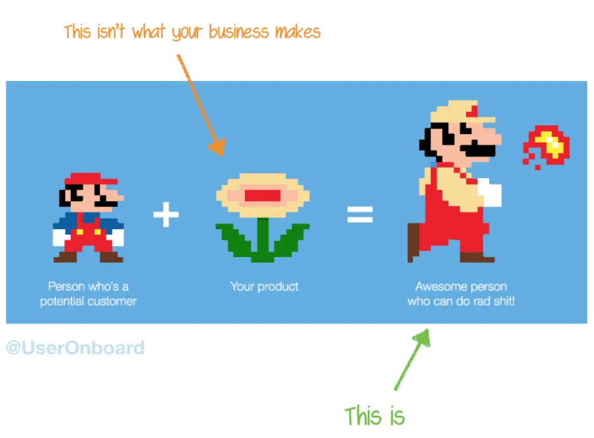
Focus on Benefits, Not Just Features
Your hero section should be about the user, not just your business. Instead of highlighting features (outputs), emphasize the transformation your product or service brings.
As Samuel Hulick says: “People don’t buy products; they buy better versions of themselves.”
Ask yourself: ✅ How does this improve the user’s life? ✅ What problem does it solve? ✅ What positive change will they experience?
Make it clear why it matters to them—that’s what drives engagement and conversions.
Examples & Insights
Here are some examples with comments. Keep in mind that these are based on best practices rather than in-depth research. In a real project, you should:
📊 Measure everything – Track performance metrics. 🔍 Conduct research – Understand your audience and test assumptions.
Use these examples as inspiration, but always validate your design choices with data.
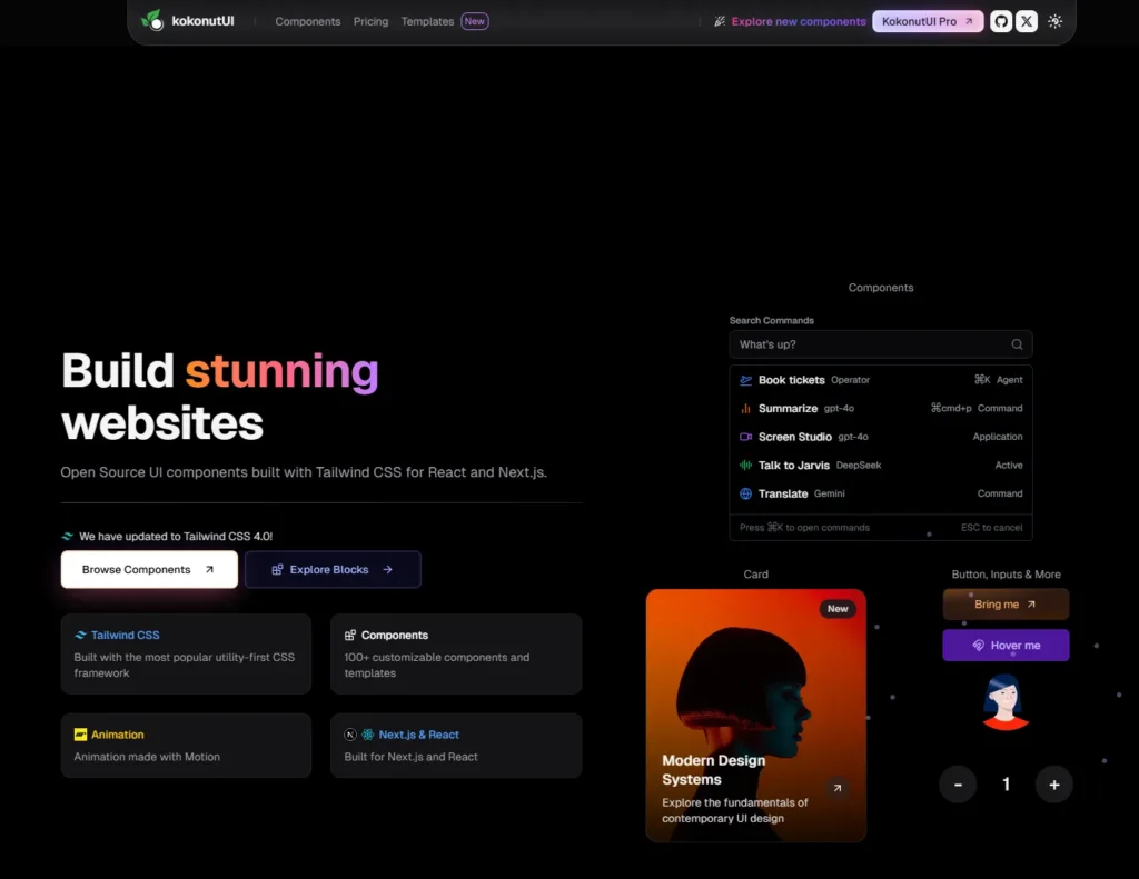
How easy it is to find the main focus points here? Which element is the clear winner? — https://kokonutui.com/
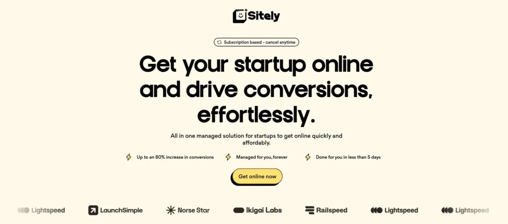
Leave out the words that has no real meaning (e.g. “effortlessly”) — https://www.sitely.cc/
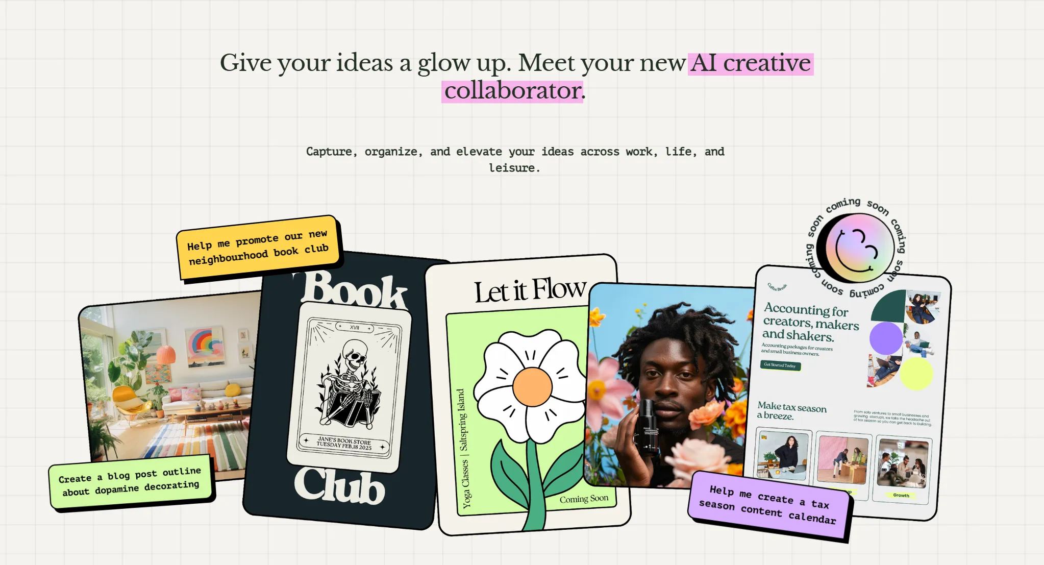
Clear benefits, but the CTA is “missing”— https://www.hidaisy.ai/
The CTA is actually at the top-right corner, I did not notice it at first (I use a quite wide monitor) , and the “coming soon” suggested that there is indeed no action I should take at this point— https://www.hidaisy.ai/
What type of research? Headline is for grabbing users’ attention, subheadline is for more details, but the headline could be clearer, too. — https://refero.design/
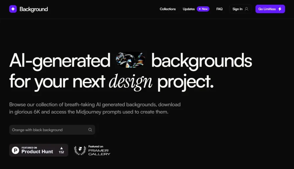
Instantly let’s you try out the tool, and the benefit + target audience are clear — https://www.background.supply/
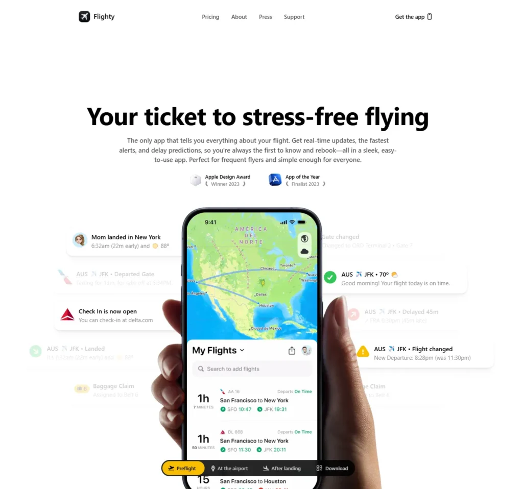
Great design, but the subheadline is a bit too long, there are parts that should be omitted (e.g. ”easy-to-use app”) — https://flighty.com/
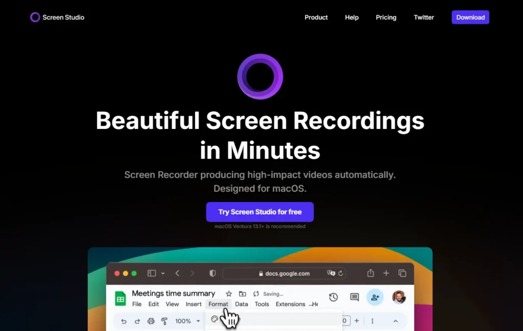
Clear value proposition (one problem though is that there are two competing CTAs with different button labels and likely with the same purpose — I’ll write about this issue in the 2nd part) — https://screen.studio/
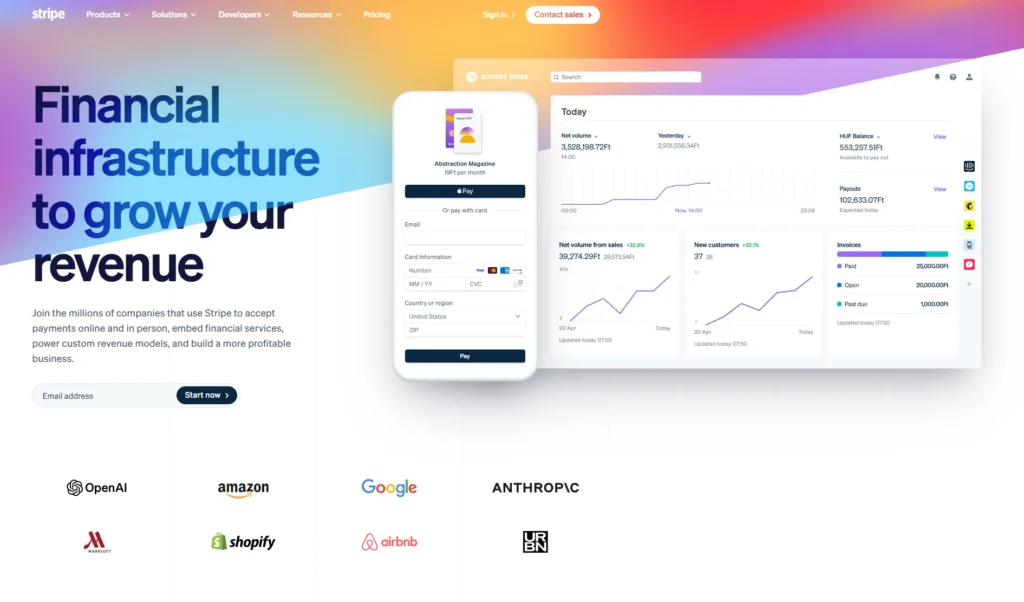
Clear value proposition, social proof included in the subheadline, and highlighting the main benefits next to the features (‘build a more profitable business”) — https://stripe.com/