Payment button is one of the most important elements for any eCommerce or SaaS website. It’s way more than just a functional element — it’s a critical touchpoint in the user journey that can make or break a transaction.
Payment button is one of the most important elements for any eCommerce or SaaS website. It’s way more than just a functional element — it’s a critical touchpoint in the user journey that can make or break a transaction.
Keywords Overview:
- Primary Keywords: payment button design, payment buttons, payment button, pay button
- Secondary Keywords: custom paypal button, paypal checkout custom button
The Power of Effective Payment Buttons in Digital Commerce
In the digital marketplace, your payment button isn’t just another element on the screen—it’s the final gateway between browsing and buying. For eCommerce and SaaS businesses, this small but mighty component can dramatically influence conversion rates and customer satisfaction.
Well-designed payment buttons serve as clear calls-to-action that guide users through the checkout process. When implemented thoughtfully, they create a seamless experience that builds trust and encourages completion. When designed poorly, they become friction points that drive customers away.
Let’s explore seven essential best practices that will transform your payment button design and help you create a more effective checkout experience.

Why Payment Buttons Matter for Your Conversion Rates
Before diving into specific design practices, it’s worth understanding the impact payment buttons have on your bottom line. According to research, optimized payment buttons can lead to significant improvements:
- Going saw a 104% month-over-month increase in trial signups after A/B testing different CTA variants
- World of Wonder achieved a 19.7% increase in conversion rates through AI-powered button optimization
- New Balance Chicago improved in-store sales by 200% with mobile-optimized landing pages and clear payment options
Your payment button represents the moment of decision—when browsers become buyers. Let’s make sure it’s designed to convert.
Essential Payment Button Elements That Drive Sales
1. Use Action-Specific Labeling
The text on your payment button should clearly communicate what happens when users click it. Generic labels like “Submit” or “Continue” create uncertainty about the next step.
Instead, use specific action verbs that leave no room for confusion:
- “Pay Now $29.99” (includes the exact amount)
- “Complete Purchase”
- “Subscribe for $9/month”
This clarity sets proper expectations and reduces hesitation. Your pay button should tell users exactly what action they’re taking and what they’re getting in return.
2. Create Visual Distinction Through Strategic Design
Your payment button should stand out visually from other elements on the page. This doesn’t just mean making it bigger—though size does matter—but creating meaningful visual hierarchy.
Consider these design elements:
- Use a contrasting color that aligns with your brand but stands apart from secondary elements
- Position the button where users naturally expect to find it (typically at the end of a form or checkout flow)
- Ensure adequate white space around the button to prevent accidental clicks on nearby elements
- Make the button large enough to be easily tapped on mobile devices (minimum 44x44px)
The goal is to make your payment button immediately identifiable as the primary action on the page.
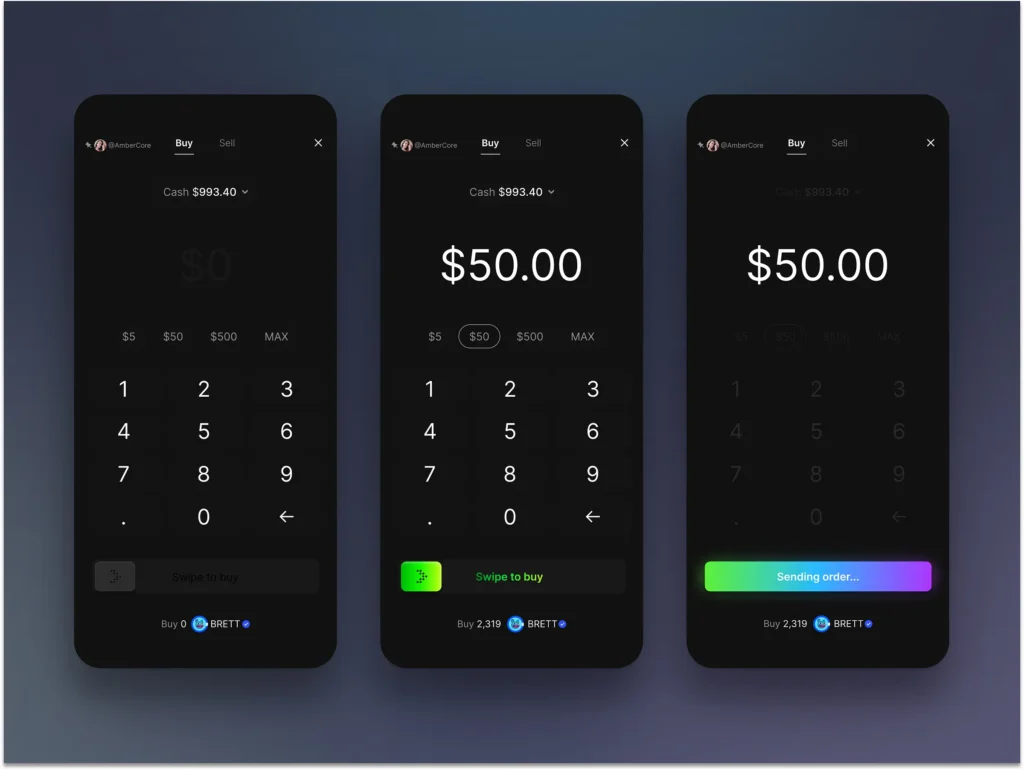
3. Provide Clear Visual Feedback During Processing
When a user clicks your payment button, the interaction shouldn’t feel like sending a request into a void. Visual feedback is crucial for maintaining user confidence during processing.
Effective payment button design includes state changes that communicate the current status:
- Initial state: Clear, actionable button
- Loading state: Visual indicator showing the system is processing (spinner, progress bar)
- Success state: Confirmation of completed transaction (checkmark, success message)
- Error state: Clear indication something went wrong (with helpful recovery options)
These visual cues keep users informed and prevent frustration or confusion. For example, a subtle animation like a spinner or pulse effect signals that the system is working, while a green checkmark provides immediate confirmation of success.
Keep animations smooth but brief—around 1 second is ideal to maintain responsiveness while providing clear feedback.
4. Disable Interaction During Processing
Visual feedback alone isn’t enough. To prevent duplicate charges or system errors, your payment button should be disabled once clicked until the process completes or fails.
This simple technical implementation prevents:
- Multiple submissions causing duplicate charges
- System errors from conflicting requests
- User confusion about whether their action was registered
The button should visually indicate this disabled state through color changes, opacity adjustments, or other design cues that signal it’s temporarily unavailable.
5. Optimize Processing Time
Even the best-designed button can’t compensate for excessively long processing times. Users expect near-immediate feedback in digital interactions.
For optimal user experience:
- Aim for payment processing under 5 seconds
- If processing exceeds 5 seconds, provide progress indicators
- After 10 seconds, consider providing additional reassurance or estimated completion time
If your payment system regularly exceeds these timeframes, it may be worth investigating technical improvements to your payment infrastructure rather than just optimizing the button design.
6. Handle Errors With Grace and Clarity
When payments fail—and occasionally they will—your error handling approach can determine whether users try again or abandon the purchase entirely.
Effective error handling for payment buttons includes:
- Clear visual indication that something went wrong
- Specific, jargon-free explanation of the issue
- Actionable guidance on how to resolve the problem
- Preservation of already-entered information when possible
For example, rather than a generic “Payment failed” message, provide specific guidance: “Your card was declined. Please check your card details or try a different payment method.”
Custom PayPal Button Implementation: Best Practices
For businesses using PayPal as a payment option, creating a custom PayPal button allows you to maintain brand consistency while leveraging a trusted payment platform. When implementing a PayPal checkout custom button, consider:
- Maintaining your brand colors and styling while incorporating the PayPal logo for trust
- Ensuring the button clearly indicates it’s a PayPal payment option
- Testing the integration thoroughly to ensure smooth handoff between your site and PayPal
7. Design for Accessibility and Inclusivity
Payment buttons must be accessible to all users, regardless of abilities or how they interact with your site.
Desktop Accessibility
- Ensure keyboard navigation works properly (users can tab to the button and activate it with Enter/Space)
- Maintain visible focus states so keyboard users know which element is selected
- Use ARIA labels to communicate button states to screen readers (e.g., “Processing payment…” or “Payment successful”)
Mobile Considerations
- Make touch targets large enough (minimum 44x44px)
- Provide adequate spacing between interactive elements
- Be cautious with “swipe to pay” patterns, which can be problematic for users with motor control limitations
While “swipe to pay” might seem engaging, it often introduces unnecessary complexity and potential for errors compared to a simple tap interaction. Unless there’s a specific security requirement, a well-designed tap-to-pay button typically provides a better user experience.
Bringing It All Together: The Complete Payment Button Experience
Effective payment button design combines visual appeal, clear communication, and technical functionality. By implementing these seven best practices, you create a payment experience that builds trust, reduces friction, and ultimately increases conversions.
Remember that your payment button is more than just a functional element—it’s a critical touchpoint in the customer journey that can make or break the transaction. Give it the attention it deserves.
For best results, regularly test your payment button design with real users and analyze performance data to identify opportunities for improvement. Small changes to your payment button can lead to significant improvements in your conversion rates and overall business performance.
Ready to optimize your checkout experience? Start by evaluating your current payment button against these seven best practices and identify opportunities to enhance your design for better results.