Next week is the 14th annual Global Accessibility Awareness Day (GAAD). This tradition was founded in 2011 with the goal of getting more people to think about and apply web accessibility practices to include users with disabilities.
Though it seems web accessibility is a priority in product development, almost 95% of home pages include WCAG conformance failures, such as low-contrast text or missing alt text, according to WebAIM.
Digital products failing to comply with WCAG standards ostracize users with disabilities. These users can range from a person with low-vision, a person who cannot use a mouse, or even a person who is colorblind. “Inclusive design” has been a buzzword in the tech industry for some time — it’s time to not only talk about this design approach for clout, but to actually do it.

Why is GAAD important?
Have you ever heard any variation of the following two phrases?
- “We just don’t have time to go back and fix the accessibility issues.”
- “The website works for me; I don’t think we have much to worry about.”
Though web accessibility continues to be a “trendy” topic, accessibility failure rates are still high (and disappointing). It is costly to go back and fix accessibility issues like keyboard accessibility or color contrast issues; but without fixing the problems, some users cannot use your website.
As a UX designer who is able-bodied (or doesn’t identify with having a disability), it can be easy to forget about users who don’t use the web the same way. For instance, let’s say you use your mouse to move a Trello card by dragging and dropping it from “Not started” to “In-progress.” A user who can only use their keyboard cannot move the card by dragging and dropping; they must have an alternative way to get the same results.
The traditional design approach doesn’t include users with disabilities, but all designers can change that by fostering an accessibility-first mindset and knowing common (but preventable) issues they should be on the lookout for. Let’s look at the current state of web accessibility, review common accessibility issues, then look at free tools to incorporate into your design practice.
What’s the current state of web accessibility?
WebAIM (Web Accessibility in Mind) published results from their “WebAIM Million” for 2025. The report is a web accessibility audit where one million home pages of top websites are tested for WCAG (Web Content Accessibility Guidelines) compliance.
Almost 95% of the million home pages tested in the report included WCAG conformance failures. To detect these failures, WebAIM used a mix of automated testing with the WAVE API tool in addition to manually testing (it is impossible to catch all accessibility issues with only automated testing).
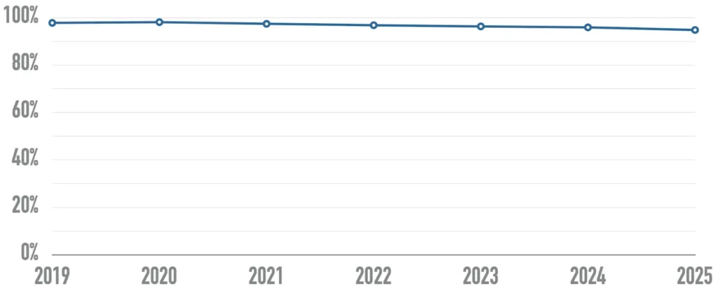
Though this report shows a slight decrease in the percentage of homepages with accessibility issues from last year (down 1.1%), it also shows a trend that home page’s average complexity increases each year. So as more and more design elements are added to home pages, they become more prone to accessibility issues.
What were the most common accessibility issues found?
96% of the detected accessibility issues fall into 6 buckets. Here are the buckets from most to least common:
- Low-contrast text: 79.1%
- Missing alternative (alt) text for images: 55.5%
- Missing form input labels: 48.2%
- Empty links: 45.4%
- Empty buttons: 29.6%
- Missing document language: 15.8%
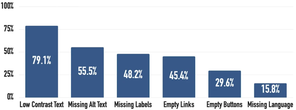
Not only were these buckets the prevalent accessibility issues found in the this WebAIM report, they’ve also been the most common for the last 5 years — showing a pattern of not addressing (and continuing to create) the same issues year after year.
What kind of user impact do these accessibility failures cause?
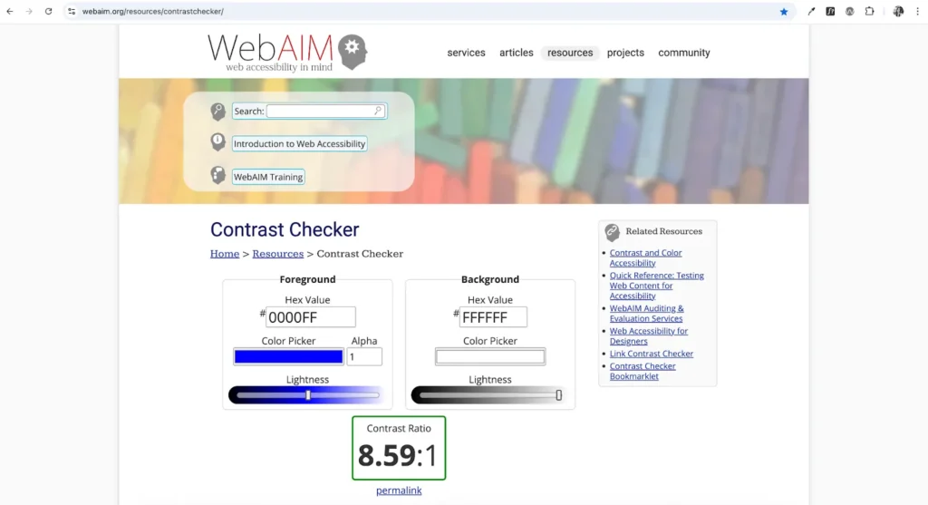
Low-contrast text: If a user with low-vision can’t read faint text, they can’t get the information they need. Any text smaller than 18 PT (or less than 14 PT bold) must have a color contrast ratio of 4.5:1 with its background so more people can read the text.
Missing alt text for images: When an image shows important information, a user who consumes content through a screen reader must be able to get that information in some other form. If an image doesn’t include alternative text (through an alt attribute), the screen reader may only read the image’s file name or nothing at all.
Missing form input labels: Let’s say a user with a screen reader is filling in a webpage’s form. If multiple input fields don’t include a label element to associate the label with the field, the screen reader will only read what the field control is (I.E., “Input” or “Select”); so the user won’t get any context or instructions for what information is requested.
Empty links: Empty links occur when an image is used as a link, but the image doesn’t include alt text. They can also occur if an element including a link is deleted without modifying the HTML. As a screen reader user navigates a web page, the screen reader will tell the user they’ve landed on a link, but the user won’t get context like what the link does.
Empty buttons: Similar to empty links, empty buttons do not describe the function of the button. So when a screen reader user is navigating a web page, the screen reader will announce the button, but the user won’t be made aware of what the button does (I.E., submits a form or logs in). So the user is forced to trigger the button to find out what it does.
Missing document language: When a webpage’s primary language isn’t specified, screen readers may misinterpret the text — hurting users who aren’t native speakers or need translation. A screen reader user may hear mispronounced words or grammar, which blocks their ability to understand the content.
Design to prevent common accessibility issues
It’s actually quite easy to prevent and fix these common accessibility issues. Given the bulk of issues detected were from the 6 buckets discussed previously, digital products could dramatically improve accessibility if they all addressed these problems.
Though some of these issues are caused by how designs were implemented, designers still have responsibility in how they handover designs to their developers.
With the following techniques, designers can proactively create accessible content as well as advocate for accessible implementation with recommendations. After designs have been implemented, designers should QA a testing environment or live product for accessibility issues to flag for remediation ASAP.
Let’s review a designer’s responsibilities and how they can QA for each accessibility bucket.
Low-contrast text
Designer’s responsibilities:
- For images of text and any text smaller than 18 PT (roughly equivalent to 24 PX), make sure the color contrast has a ratio of at least 4.5:1
- For text larger than 18 PT (or 14 PT bold), make sure the color contrast has a ratio of at least 3:1
- The only exceptions to this color requirements are logotypes, inactive/ disabled UI controls, or any pure decorative element (I.E., divider lines)
How to QA websites for low-contrast text:
- Manually check your design’s color using contrast checker tools like WebAIM or with Figma’s native color contrast tool
- Run an automated accessibility testing tool (like Silktide) on your browser-based product to flag color contrast issues that should be double-checked
Missing alt text
Designer’s responsibilities:
- Write recommended alt text for each image used on a web page (under 150 characters)
-
For images, suggest using the alt attribute on the
element
-
For SVGs, suggest giving the SVG role="img"and using a
attribute (I.E., <svg role="img" title="A brown circle"><circle cx="30" cy="30" r="10" fill="blue"></circle></svg>)</span> </li> <li class="elementor-icon-list-item"> <span class="elementor-icon-list-icon"> <svg aria-hidden="true" class="e-font-icon-svg e-far-dot-circle" viewBox="0 0 512 512" xmlns="http://www.w3.org/2000/svg"><path d="M256 56c110.532 0 200 89.451 200 200 0 110.532-89.451 200-200 200-110.532 0-200-89.451-200-200 0-110.532 89.451-200 200-200m0-48C119.033 8 8 119.033 8 256s111.033 248 248 248 248-111.033 248-248S392.967 8 256 8zm0 168c-44.183 0-80 35.817-80 80s35.817 80 80 80 80-35.817 80-80-35.817-80-80-80z"></path></svg> </span> <span class="elementor-icon-list-text">If the image is purely decorative, suggest using a null alt attribute (alt="")</span> </li> </ul> </div> </div> <div class="elementor-element elementor-element-5c3104a elementor-widget elementor-widget-heading" data-id="5c3104a" data-element_type="widget" data-widget_type="heading.default"> <div class="elementor-widget-container"> <span class="elementor-heading-title elementor-size-default">How to QA websites for missing alt text: </span> </div> </div> <div class="elementor-element elementor-element-24d9106 elementor-icon-list--layout-traditional elementor-list-item-link-full_width elementor-widget elementor-widget-icon-list" data-id="24d9106" data-element_type="widget" data-widget_type="icon-list.default"> <div class="elementor-widget-container"> <ul class="elementor-icon-list-items"> <li class="elementor-icon-list-item"> <span class="elementor-icon-list-icon"> <svg aria-hidden="true" class="e-font-icon-svg e-far-dot-circle" viewBox="0 0 512 512" xmlns="http://www.w3.org/2000/svg"><path d="M256 56c110.532 0 200 89.451 200 200 0 110.532-89.451 200-200 200-110.532 0-200-89.451-200-200 0-110.532 89.451-200 200-200m0-48C119.033 8 8 119.033 8 256s111.033 248 248 248 248-111.033 248-248S392.967 8 256 8zm0 168c-44.183 0-80 35.817-80 80s35.817 80 80 80 80-35.817 80-80-35.817-80-80-80z"></path></svg> </span> <span class="elementor-icon-list-text">Manually read the alt text for images to ensure it’s descriptive of the image and ensure any decorative images doesn’t have alt text</span> </li> <li class="elementor-icon-list-item"> <span class="elementor-icon-list-icon"> <svg aria-hidden="true" class="e-font-icon-svg e-far-dot-circle" viewBox="0 0 512 512" xmlns="http://www.w3.org/2000/svg"><path d="M256 56c110.532 0 200 89.451 200 200 0 110.532-89.451 200-200 200-110.532 0-200-89.451-200-200 0-110.532 89.451-200 200-200m0-48C119.033 8 8 119.033 8 256s111.033 248 248 248 248-111.033 248-248S392.967 8 256 8zm0 168c-44.183 0-80 35.817-80 80s35.817 80 80 80 80-35.817 80-80-35.817-80-80-80z"></path></svg> </span> <span class="elementor-icon-list-text">Run an automated accessibility testing tool on your browser-based product to flag any image or SVG that doesn’t include alt text, and isn’t marked as decorative</span> </li> </ul> </div> </div> <div class="elementor-element elementor-element-2a5a518d elementor-widget elementor-widget-ha-post-comments happy-addon ha-post-comments" data-id="2a5a518d" data-element_type="widget" data-widget_type="ha-post-comments.default"> <div class="elementor-widget-container"> <div id="comments"> <div id="respond" class="comment-respond"> <h3 id="reply-title" class="comment-reply-title">Leave a Comment <small><a rel="nofollow" id="cancel-comment-reply-link" href="/2025/05/24/95-of-homepages-are-inaccessible/#respond" style="display:none;">Cancel reply</a></small></h3><form action="https://theuxlens.com/wp-comments-post.php" method="post" id="commentform" class="comment-form" novalidate><p class="comment-form-comment"><label for="comment" class="screen-reader-text">Comment</label><textarea id="comment" name="comment" cols="45" rows="8" required></textarea></p><label for="author" class="screen-reader-text">Name</label><input placeholder="Name *" id="author" name="author" type="text" value="" size="30" required /> <label for="email" class="screen-reader-text">Email</label><input placeholder="Email *" id="email" name="email" type="email" value="" size="30" required /> <label for="url" class="screen-reader-text">Website</label><input placeholder="Website" id="url" name="url" type="url" value="" size="30" /> <p class="comment-form-cookies-consent"><input id="wp-comment-cookies-consent" name="wp-comment-cookies-consent" type="checkbox" value="yes" /> <label for="wp-comment-cookies-consent">Save my name, email, and website in this browser for the next time I comment.</label></p> <p class="form-submit"><input name="submit" type="submit" id="submit" class="submit" value="Post Comment" /> <input type='hidden' name='comment_post_ID' value='932' id='comment_post_ID' /> <input type='hidden' name='comment_parent' id='comment_parent' value='0' /> </p></form> </div><!-- #respond --> </div><!-- #comments --> </div> </div> </div> <div class="elementor-element elementor-element-67a84a52 e-con-full e-flex e-con e-child" data-id="67a84a52" data-element_type="container" data-settings="{"_ha_eqh_enable":false}"> <div class="elementor-element elementor-element-7282ff1f elementor-widget__width-inherit elementor-widget elementor-widget-sidebar" data-id="7282ff1f" data-element_type="widget" data-widget_type="sidebar.default"> <div class="elementor-widget-container"> <aside id="block-2" class="widget inner-padding widget_block widget_search"><form role="search" method="get" action="https://theuxlens.com/" class="wp-block-search__button-outside wp-block-search__text-button wp-block-search" ><label class="wp-block-search__label" for="wp-block-search__input-1" >Search</label><div class="wp-block-search__inside-wrapper " ><input class="wp-block-search__input" id="wp-block-search__input-1" placeholder="" value="" type="search" name="s" required /><button aria-label="Search" class="wp-block-search__button wp-element-button" type="submit" >Search</button></div></form></aside><aside id="block-3" class="widget inner-padding widget_block"><div class="wp-block-group"><div class="wp-block-group__inner-container is-layout-flow wp-block-group-is-layout-flow"><h2 class="wp-block-heading">Recent Posts</h2><ul class="wp-block-latest-posts__list wp-block-latest-posts"><li><a class="wp-block-latest-posts__post-title" href="https://theuxlens.com/2025/05/24/95-of-homepages-are-inaccessible/">95% of homepages are inaccessible</a></li> <li><a class="wp-block-latest-posts__post-title" href="https://theuxlens.com/2025/05/18/payment-button-design-trends-best-practices/">Payment Button Design Trends & Best Practices </a></li> <li><a class="wp-block-latest-posts__post-title" href="https://theuxlens.com/2025/05/16/why-japanese-websites-look-so-different/">Why Japanese Websites Look So Different</a></li> <li><a class="wp-block-latest-posts__post-title" href="https://theuxlens.com/2025/04/20/how-i-actually-use-ai-in-ux-design/">How I Actually Use AI in UX Design</a></li> <li><a class="wp-block-latest-posts__post-title" href="https://theuxlens.com/2025/04/19/7-ui-ux-principles-every-dev-should-know/">7 UI UX Principles Every Dev Should Know</a></li> </ul></div></div></aside><aside id="block-4" class="widget inner-padding widget_block"><div class="wp-block-group"><div class="wp-block-group__inner-container is-layout-flow wp-block-group-is-layout-flow"><h2 class="wp-block-heading">Recent Comments</h2><ol class="wp-block-latest-comments"><li class="wp-block-latest-comments__comment"><article><footer class="wp-block-latest-comments__comment-meta"><a class="wp-block-latest-comments__comment-author" href="https://theuxlens.com">Admin</a> on <a class="wp-block-latest-comments__comment-link" href="https://theuxlens.com/2025/04/19/i-studied-the-ux-ui-of-over-200-onboarding-flows-heres-everything-i-learned/#comment-42">I studied the UX/UI of over 200 onboarding flows — here’s everything I learned</a></footer></article></li><li class="wp-block-latest-comments__comment"><article><footer class="wp-block-latest-comments__comment-meta"><a class="wp-block-latest-comments__comment-author" href="https://theuxlens.com">Admin</a> on <a class="wp-block-latest-comments__comment-link" href="https://theuxlens.com/2025/04/19/i-studied-the-ux-ui-of-over-200-onboarding-flows-heres-everything-i-learned/#comment-41">I studied the UX/UI of over 200 onboarding flows — here’s everything I learned</a></footer></article></li><li class="wp-block-latest-comments__comment"><article><footer class="wp-block-latest-comments__comment-meta"><a class="wp-block-latest-comments__comment-author" href="https://cybertechhub.top">Business</a> on <a class="wp-block-latest-comments__comment-link" href="https://theuxlens.com/2025/04/19/i-studied-the-ux-ui-of-over-200-onboarding-flows-heres-everything-i-learned/#comment-40">I studied the UX/UI of over 200 onboarding flows — here’s everything I learned</a></footer></article></li><li class="wp-block-latest-comments__comment"><article><footer class="wp-block-latest-comments__comment-meta"><a class="wp-block-latest-comments__comment-author" href="https://kikma.site">VK</a> on <a class="wp-block-latest-comments__comment-link" href="https://theuxlens.com/2025/04/19/i-studied-the-ux-ui-of-over-200-onboarding-flows-heres-everything-i-learned/#comment-39">I studied the UX/UI of over 200 onboarding flows — here’s everything I learned</a></footer></article></li><li class="wp-block-latest-comments__comment"><article><footer class="wp-block-latest-comments__comment-meta"><a class="wp-block-latest-comments__comment-author" href="https://theuxlens.com">Admin</a> on <a class="wp-block-latest-comments__comment-link" href="https://theuxlens.com/2025/04/04/figmas-not-a-design-tool-its-a-rube-goldberg-machine-for-avoiding-code/#comment-37">Figma’s not a design tool — it’s a Rube Goldberg machine for avoiding code</a></footer></article></li></ol></div></div></aside><aside id="block-5" class="widget inner-padding widget_block"><div class="wp-block-group"><div class="wp-block-group__inner-container is-layout-flow wp-block-group-is-layout-flow"><h2 class="wp-block-heading">Archives</h2><ul class="wp-block-archives-list wp-block-archives"> <li><a href='https://theuxlens.com/2025/05/'>May 2025</a></li> <li><a href='https://theuxlens.com/2025/04/'>April 2025</a></li> <li><a href='https://theuxlens.com/2025/03/'>March 2025</a></li> <li><a href='https://theuxlens.com/2025/02/'>February 2025</a></li> <li><a href='https://theuxlens.com/2025/01/'>January 2025</a></li> <li><a href='https://theuxlens.com/2024/12/'>December 2024</a></li> </ul></div></div></aside><aside id="block-6" class="widget inner-padding widget_block"><div class="wp-block-group"><div class="wp-block-group__inner-container is-layout-flow wp-block-group-is-layout-flow"><h2 class="wp-block-heading">Categories</h2><ul class="wp-block-categories-list wp-block-categories"> <li class="cat-item cat-item-15"><a href="https://theuxlens.com/category/dashboard/">Dashboard</a> </li> <li class="cat-item cat-item-28"><a href="https://theuxlens.com/category/plugin/">Plugin</a> </li> <li class="cat-item cat-item-33"><a href="https://theuxlens.com/category/ui-design/">UI Design</a> </li> <li class="cat-item cat-item-31"><a href="https://theuxlens.com/category/ux-design/">UX Design</a> </li> <li class="cat-item cat-item-16"><a href="https://theuxlens.com/category/website/">Website</a> </li> </ul></div></div></aside> </div> </div> </div> </div> </div> </div> </div> <div class="site-footer"> <footer class="site-info" aria-label="Site" itemtype="https://schema.org/WPFooter" itemscope> <div class="inside-site-info grid-container"> <div class="copyright-bar"> <span class="copyright">© 2025 </span> • Built with <a href="https://generatepress.com" itemprop="url">GeneratePress</a> </div> </div> </footer> </div> <script type="speculationrules"> {"prefetch":[{"source":"document","where":{"and":[{"href_matches":"\/*"},{"not":{"href_matches":["\/wp-*.php","\/wp-admin\/*","\/wp-content\/uploads\/*","\/wp-content\/*","\/wp-content\/plugins\/*","\/wp-content\/themes\/generatepress\/*","\/*\\?(.+)"]}},{"not":{"selector_matches":"a[rel~=\"nofollow\"]"}},{"not":{"selector_matches":".no-prefetch, .no-prefetch a"}}]},"eagerness":"conservative"}]} </script> <script id="generate-a11y"> !function(){"use strict";if("querySelector"in document&&"addEventListener"in window){var e=document.body;e.addEventListener("pointerdown",(function(){e.classList.add("using-mouse")}),{passive:!0}),e.addEventListener("keydown",(function(){e.classList.remove("using-mouse")}),{passive:!0})}}(); </script> <script> ; (function($, w) { 'use strict'; let $window = $(w); $(document).ready(function() { let isEnable = ""; let isEnableLazyMove = ""; let speed = isEnableLazyMove ? '0.7' : '0.2'; if( !isEnable ) { return; } if (typeof haCursor == 'undefined' || haCursor == null) { initiateHaCursorObject(speed); } setTimeout(function() { let targetCursor = $('.ha-cursor'); if (targetCursor) { if (!isEnable) { $('body').removeClass('hm-init-default-cursor-none'); $('.ha-cursor').addClass('ha-init-hide'); } else { $('body').addClass('hm-init-default-cursor-none'); $('.ha-cursor').removeClass('ha-init-hide'); } } }, 500); }); }(jQuery, window)); </script> <script> const lazyloadRunObserver = () => { const lazyloadBackgrounds = document.querySelectorAll( `.e-con.e-parent:not(.e-lazyloaded)` ); const lazyloadBackgroundObserver = new IntersectionObserver( ( entries ) => { entries.forEach( ( entry ) => { if ( entry.isIntersecting ) { let lazyloadBackground = entry.target; if( lazyloadBackground ) { lazyloadBackground.classList.add( 'e-lazyloaded' ); } lazyloadBackgroundObserver.unobserve( entry.target ); } }); }, { rootMargin: '200px 0px 200px 0px' } ); lazyloadBackgrounds.forEach( ( lazyloadBackground ) => { lazyloadBackgroundObserver.observe( lazyloadBackground ); } ); }; const events = [ 'DOMContentLoaded', 'elementor/lazyload/observe', ]; events.forEach( ( event ) => { document.addEventListener( event, lazyloadRunObserver ); } ); </script> <script src="https://theuxlens.com/wp-content/plugins/blog-designer-for-elementor/assets/js/owl-carousel.min.js" id="owl-carousel-js"></script> <script src="https://theuxlens.com/wp-content/plugins/blog-designer-for-elementor/assets/js/main.js" id="bdfe-main-js"></script> <!--[if lte IE 11]> <script src="https://theuxlens.com/wp-content/themes/generatepress/assets/js/classList.min.js?ver=3.6.0" id="generate-classlist-js"></script> <![endif]--> <script id="generate-menu-js-before"> var generatepressMenu = {"toggleOpenedSubMenus":true,"openSubMenuLabel":"Open Sub-Menu","closeSubMenuLabel":"Close Sub-Menu"}; </script> <script src="https://theuxlens.com/wp-content/themes/generatepress/assets/js/menu.min.js?ver=3.6.0" id="generate-menu-js"></script> <script src="https://theuxlens.com/wp-includes/js/comment-reply.min.js?ver=6.8.1" id="comment-reply-js" async data-wp-strategy="async"></script> <script src="https://theuxlens.com/wp-content/plugins/happy-elementor-addons/assets/js/extension-reading-progress-bar.min.js?ver=3.16.5" id="happy-reading-progress-bar-js"></script> <script src="https://theuxlens.com/wp-content/plugins/elementor/assets/js/webpack.runtime.min.js?ver=3.29.2" id="elementor-webpack-runtime-js"></script> <script src="https://theuxlens.com/wp-content/plugins/elementor/assets/js/frontend-modules.min.js?ver=3.29.2" id="elementor-frontend-modules-js"></script> <script src="https://theuxlens.com/wp-includes/js/jquery/ui/core.min.js?ver=1.13.3" id="jquery-ui-core-js"></script> <script id="elementor-frontend-js-before"> var elementorFrontendConfig = {"environmentMode":{"edit":false,"wpPreview":false,"isScriptDebug":false},"i18n":{"shareOnFacebook":"Share on Facebook","shareOnTwitter":"Share on Twitter","pinIt":"Pin it","download":"Download","downloadImage":"Download image","fullscreen":"Fullscreen","zoom":"Zoom","share":"Share","playVideo":"Play Video","previous":"Previous","next":"Next","close":"Close","a11yCarouselPrevSlideMessage":"Previous slide","a11yCarouselNextSlideMessage":"Next slide","a11yCarouselFirstSlideMessage":"This is the first slide","a11yCarouselLastSlideMessage":"This is the last slide","a11yCarouselPaginationBulletMessage":"Go to slide"},"is_rtl":false,"breakpoints":{"xs":0,"sm":480,"md":768,"lg":1025,"xl":1440,"xxl":1600},"responsive":{"breakpoints":{"mobile":{"label":"Mobile Portrait","value":767,"default_value":767,"direction":"max","is_enabled":true},"mobile_extra":{"label":"Mobile Landscape","value":880,"default_value":880,"direction":"max","is_enabled":false},"tablet":{"label":"Tablet Portrait","value":1024,"default_value":1024,"direction":"max","is_enabled":true},"tablet_extra":{"label":"Tablet Landscape","value":1200,"default_value":1200,"direction":"max","is_enabled":false},"laptop":{"label":"Laptop","value":1366,"default_value":1366,"direction":"max","is_enabled":false},"widescreen":{"label":"Widescreen","value":2400,"default_value":2400,"direction":"min","is_enabled":false}},"hasCustomBreakpoints":false},"version":"3.29.2","is_static":false,"experimentalFeatures":{"e_font_icon_svg":true,"additional_custom_breakpoints":true,"container":true,"e_local_google_fonts":true,"nested-elements":true,"editor_v2":true,"e_element_cache":true,"home_screen":true,"launchpad-checklist":true,"cloud-library":true,"e_opt_in_v4_page":true},"urls":{"assets":"https:\/\/theuxlens.com\/wp-content\/plugins\/elementor\/assets\/","ajaxurl":"https:\/\/theuxlens.com\/wp-admin\/admin-ajax.php","uploadUrl":"https:\/\/theuxlens.com\/wp-content\/uploads"},"nonces":{"floatingButtonsClickTracking":"29db645027"},"swiperClass":"swiper","settings":{"page":{"ha_cmc_init_switcher":"no"},"editorPreferences":[]},"kit":{"active_breakpoints":["viewport_mobile","viewport_tablet"],"global_image_lightbox":"yes","lightbox_enable_counter":"yes","lightbox_enable_fullscreen":"yes","lightbox_enable_zoom":"yes","lightbox_enable_share":"yes","lightbox_title_src":"title","lightbox_description_src":"description","ha_rpb_enable":"no"},"post":{"id":932,"title":"95%25%20of%20homepages%20are%20inaccessible","excerpt":"","featuredImage":"https:\/\/theuxlens.com\/wp-content\/uploads\/2025\/05\/Main-2.png"}}; </script> <script src="https://theuxlens.com/wp-content/plugins/elementor/assets/js/frontend.min.js?ver=3.29.2" id="elementor-frontend-js"></script> <script src="https://theuxlens.com/wp-content/plugins/visual-footer-credit-remover/script.js?ver=6.8.1" id="jabvfcr_script-js"></script> <script id="happy-elementor-addons-js-extra"> var HappyLocalize = {"ajax_url":"https:\/\/theuxlens.com\/wp-admin\/admin-ajax.php","nonce":"f52490d7c7","pdf_js_lib":"https:\/\/theuxlens.com\/wp-content\/plugins\/happy-elementor-addons\/assets\/vendor\/pdfjs\/lib"}; </script> <script src="https://theuxlens.com/wp-content/plugins/happy-elementor-addons/assets/js/happy-addons.min.js?ver=3.16.5" id="happy-elementor-addons-js"></script> </body> </html>